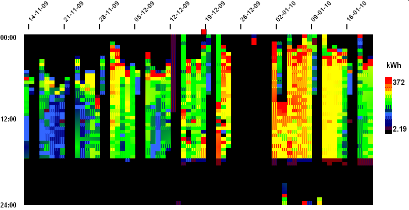
When you look at this example, you can see numerous features:
A 'heat-map' chart is a powerful visualisation technique that can easily show ten weeks' half-hourly data in a single screen. In the chart each vertical slice is one day, running midnight to midnight top to bottom, with each half-hourly cell colour-coded according to demand to create a contour-map effect.
This for example is the pattern of a building's gas consumption.
When you look at this example, you can
see numerous features:
Optimised startup time (delayed in less-cold weather);
Off at weekends but with some heating early on Saturday mornings;
Peak output during startup;
Fixed 'off' time;
Shut-down over Christmas and New Year